Whether you’re painting the front porch of the home or a bedroom wall, you need to choose colors that will coordinate with the rest of the house. You should also choose colors that demonstrate your personality or that follow the trends of the year. There are also a few shades and design ideas with paint that you want to avoid in 2018 before you get to work.
Gorgeous Greens
Various shades of green are among the top trends that you’ll notice in 2018 where paint colors are concerned. Sage is a lighter shade of green that is common in kitchens and dining rooms. It’s often paired with furniture and decorations that are darker colors. Sage is noted as a combination of gray and green. These colors blended together offer a soft appearance while adding life to the room at the same time.
Sunny Yellow Hues
From marigold to butterscotch, shades of yellow are among the most popular color trends for the year. The colors work well in kitchens, but you could also use them in a bathroom or living room. Avoid using shades of yellow in the bedroom as the color can be too stimulating for an environment where you’re supposed to relax and go to sleep. Create patterns and designs of yellow and white or other light colors for an uplifting look in the home. Yellow is a cheerful color that often puts people in a good mood, which is why it’s a good option to consider for areas of the home where several people gather at one time.
Vivid Violet
While purple isn’t a color that has been seen much on walls in the past, it’s a color that is stepping out at the forefront of trending shades in 2018. You want to choose a bold shade of purple if it’s the only color that you’re going to use. If you plan on combining purple with another color, such as gray or black, then consider a lighter shade as you want to accent both colors in the room. Purple can be a thought-provoking color at times as well as one that is entertaining to the eye. When decorating the room, use a combination of picture frames that are in dark and light colors as well as crystal or pearl accents on the tables and shelves. Plum is a darker color that works well on doors and as an accent color in a room with green paint.
Radiant Reds
Red is a color that can be absolutely beautiful in the right shades. It’s not as popular as some other colors for 2018, but brighter shades teamed with white or light gray trim work well in the living room or den of the home. Red is a color that exudes energy. Consider using cranberry if you want something a little brighter and crimson for more of a romantic or passionate appearance. Avoid using shades of red that are too bright because they can be overwhelming to the eye. If you enjoy cozy colors, then consider auburn or maple. These shades can also add spice to the home, especially the kitchen or an area where your family or guests will enter the home.
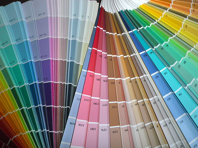
When you’re deciding on colors for the home, find shades that showcase your personality and the statement that you’re trying to make with the rest of the furniture and decorations. Look at home design inspiration sites to figure out what you like and what you don’t. Take a few paint samples home so that you can see what they would look like on the walls before painting. Once the walls are finished, find the right shades for the trim to bring everything to life.
Whether you plan to add a bold pop of color with an accent wall or completely upgrade your entire home, Ridge Painting Company is ready to make your walls look better than ever. See our Before and After gallery here!